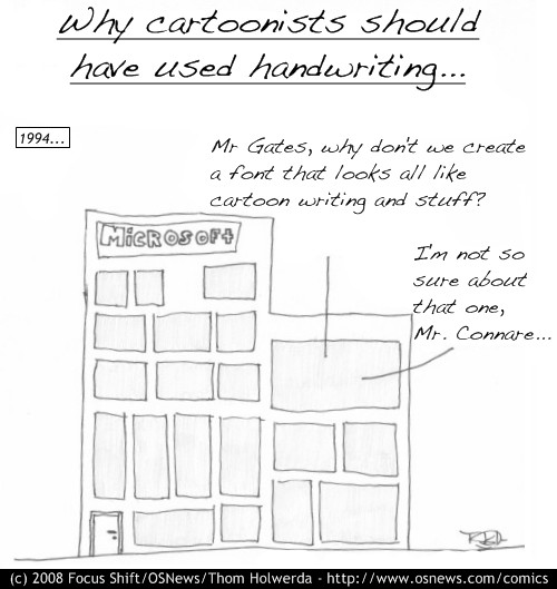
Comic: “Handwriting”.

Yes, from now on, I’ll be using a computer font for Focus Shift. It’s called Dakota Handwriting. Enjoy.
Comic: “Handwriting”.

Yes, from now on, I’ll be using a computer font for Focus Shift. It’s called Dakota Handwriting. Enjoy.
I must say, it’s fun to see you exploring this new creative medium here on OSNews. (I mean that sincerely.)
But… now the rest of the drawing looks really sucky next to the cool handwriting font.
As someone whose drawing skills are even worse than yours… I’m anxiously awaiting the solution to *that* problem. 😉
Pull this off, and there’s hope for *all* of us!
Well, the new font was a necessity (not just for readability, but also it was a pain to write in a sensible way, that made everything fit and such). The drawings are crappy because, well, I simply can’t do better, and there’s little I can do to improve this. I see it as a limitation I need to work around.
Another limitation is not having the ability to draw humans. I can’t do stick figures since that would be taken quite clearly from xkcd and C&H.
I’m pondering how to solve this issue. My bestest best friend has a really simple and elegant style in drawing humans (a style I can easily recreate) but I’m fairly sure she based it on her favourite comic, so I’m not sure I can use it.
Who knows.
Instead of ‘working around’ your ‘sucky drawing’, why not try to work with it, and make it a trademark of your comics? Creating your own style generally sets you away from the rest of the crowd. (Take xkcd with its stick figures, for instance.)
As for the people, you’ll have to work them into the above.
Good luck with it all.
With ‘working around’ I mean that I need to be creative in order to be able to convey as much meaning with drawings as people who can draw can.
Get it? .
.
If you just tried using Inkscape, most of your drawings are probably easier to create with Inkscape once you know what you are trying to create. I mean, all you are doing is basic outlined blocks. That’s why people are frustrated, because they know if you spent 5 minutes attempting it, you could use i.e. Inkscape to knock up your cartoons in no time.
Clicky: http://www.inkscape.org
I have a tablet, and I tried using it, but it simply sucks (I have Adobe Illustrator). It just doesn’t work like a real, proper pen, and all the freedom and control that comes with it. The style won’t change, it’s the way it is, and if you don’t like it, you can always not read them.
This is the last comment on the style of the comics. Any other comment regarding the style on this or future comics will be deleted. You are free to discuss the content of the comic, or the message it tries to convey.
Edited 2008-02-17 21:54 UTC
Thom,
I don’t think that setting such a policy is a good idea. Let people criticize it. I certainly have enjoyed your work. And so have many others. If I may be so bold… you have taken this attitude before regarding moderation on the OSNews site in general. And it left a bad taste in many readers’ mouths. Such heavy-handed moderation techniques are bound to.
And whatever happened to Focus Shift “lightening the mood” on OSNews?
Unless you think that:
helps to lighten the mood on OSNews, then I should say that it would be best to discontinue the effort.
I would not do so. I believe that it has been a successful undertaking, thus far, and has much potential.
Criticism is all good and okay with me, but it has been shown quite clearly that 95% of the people can’t get beyond the “It sucks!!” comments. That is not constructive, and downright rude, too.
Okay, let’s put it this way: any “this sucks!!” comment will be removed.
that sucks!
That’s because you’re doing it wrong. This is not a strong style for tablet/pen art. Try making it using the mouse. Add box, resize box. Add text, move, resize text. Keep it simple. You’ve taken an artists approach, not the designers. Think like a designer. Boxes, not brushes.
Edited 2008-02-18 01:20 UTC
I’m not familiar with laws on the subject so I decided to be dumb and ask: Is it really possible that xkcd or anyone else move an action because of the use of stick figures on comic sites ?
Did they patent that thing in the Upper Paleolithic or something ? I mean… that’s just nonsense. If the guy picks a style that every five years old kid develops alone, he can’t really complain that other people are using it, now can they ?
Not that I’m saying that you should use it, I like the comics the way they are, although I don’t understand quite a few.
There’s always the Jerkcity approach of using the old MS Comic Chat IRC client, and taking screenshots – there’s even a webcomic out there “drawn” in ASCII art.
I think the drawing would be ok if the content was actually entertaining….
Then contribute some witty ideas? The content tends to be a bit on the esoteric side. You have to know about Apple’s Cube. You have to remember stories from weeks back about why there’s a Microsoft Home Server in the house. And I do find myself scratching my head, wondering what some of them mean, until someone else shows up to explain. They are, in that way, educational. And a bit fun, once you get them.
I think that what many people expect of a comic is that they should be able to “get it” in a few seconds and go on. (Mary Worth fans may leave the room now.) Focus Shift would seem to be more of a challenge than that. Which is perfectly fine with me.
I think when most people say that they don’t understand the comics it’s a polite way of saying that the comics aren’t funny.
I have not noticed a lot of politeness among the critics.
Some. Just not that much.
…but you misspelled “Connard” :p
I don’t know if it was intentional but it reminded me of that famous line from Coluche (a famous french humorist) in a movie where someone calls him “Connard!” and he replies: “Monsieur Connard”
Edited 2008-02-18 08:41 UTC
Actually, you’re missing the joke (see here: http://en.wikipedia.org/wiki/Comic_Sans ), apparently. Vincent Connare was the designer of Comic Sans, arguably the most-abused Windows typeface. Good choice on Handwriting – Dakota; for a handwriting font, I’ve always liked it.
I knew the joke was about ms comics sans, but I did miss the joke. The guy’s name is fitting though, I hate this font
I assume this is a jab at Comic Sans:
http://bancomicsans.com/
Anyone who uses Comic Sans should be sentences to 10 years of hard labour, and a year of ‘correct font selection’ class.
Some people have too much time on their hands.
Real handwriting shows personality.
Besides, I don’t get it: you’re making fun of cartoonists for using a font and then you’re switching to using a font at the same time? Did I miss something here?
The irony.
Could you please add a “Comments” link in the “latest comic” thumbnail option in the OS news main page?
All the entries have one link to the comments page directly.
Dude, I’ve never seen a quality comic that uses a typed font rather than handwriting for the words on it. It kinda spoils the authenticity of it, because I know your gonna be writing big fancy money making comics in the future 😉
I agree with you!!!
Thom, do not use font, there are some people (including me) that like the handwriting comics!!
Jeph Jacques of Questionable Content uses a font to letter all of his comics.
The proof is in the news blurb on the right side.
http://questionablecontent.net/view.php?comic=258