Ever since I bought my HTC HD7 way back in October 2010, I have been hooked on Windows Phone. Without even being able to test-drive the new operating system (The Netherlands didn’t get Windows Phone 7 until a year later), I imported the HD7 from the US – the minimalist, stark, clean, flat, and textual interface spoke to me, and I just knew I would like it. And like it, I did.
However, I’ve never been able to properly explain why I like it so much. There’s no single thing that I can point to and say, that’s it. Especially early on, using Windows Phone 7 presented a number of difficulties for me, since I couldn’t buy any applications (the application store wasn’t accessible from The Netherlands), and features like Xbox integration were disabled as well due to my geographical location. Despite these limitations, I fell in love.
Since I believe in using as many different platforms as possible to broaden my perspective, when my contract ran out and I got to pick a new phone when extending it, I decided to go with Android. The Galaxy SII, running Gingerbread with TouchWiz, was a pretty good phone, but it didn’t fit me as well as Windows Phone did – even though Android was infinitely more useful.
As such, the decision to jump onto the Windows Phone 8 train late last year wasn’t a hard one to make. Even though my contract wouldn’t run out for another year, the value proposition of Windows Phone 8 was too appealing to ignore (better and faster than WP7). I bought the HTC 8X off-contract, and it fulfilled all my expectations. Yes, as far as versatility and functionality goes, I’m taking a step back compared to my Galaxy SII running CyanogenMod 10.1, but the overall user experience Windows Phone 8 offers is simply a hell of a lot more polished, smooth, and attuned to what I personally like. I’ve still got my SII (and Nexus 7) to experiment and play around with Android – while my 8X is my preferred device for the core tasks a smartphone has to perform for me.
At the same time, I fully understand that Windows Phone is not for everyone. In fact, I’d argue that its visually unique interface is exactly what puts many consumers off. Despite grandiose claims to the contrary, both iOS and Android are still classic ‘WIMP’ interfaces 1 – something I’ve argued before – and while the same applies to Windows Phone’s Metro interface, it does its very best to hide said fact from the user 2.
Simply put: even though iOS/Android and Windows Phone are functionally pretty much the same, the former two look like small desktops, while the latter looks like some futuristic interface that works entirely differently (even though it doesn’t). Metro takes flat design to its visual very extremes, without actually altering the underlying WIMP concepts.
Before we continue, I think it’s time to arrive at a better term for what is being referred to as flat design – mostly because flat design generally isn’t flat at all. If you’ve ever used Windows Phone, you’ll have noticed that many of its animations are decidedly three dimensional. Opening and closing applications, the most common animations you’ll encounter, are three dimensional, as is the application switcher. Considering animations are a core aspect of the interface, “flat” is simply not a proper moniker, since it only refers to static GUI elements.
As such, I much prefer the term “digital”. This is actually how Microsoft itself describes Metro – “authentically digital” – and it’s a far better description of this design style than “flat”. It also creates a nice continuum, from Apple’s focus on skeuomorphism, through Android’s more digital Holo, to the other extreme where Metro resides, as Andrew Kim neatly illustrates (taken from his impressive work redefining the Microsoft brand).
Similarly, for the sake of this article and consistency with the term “digital”, I’m going to refer to the other end of the spectrum as “analog”. These past few months, the term “skeuomorphic” has gotten a bit of a negative connotation for many, which I think is unfortunate. I personally dislike skeuomorphic design – but there’s nothing inherently wrong with it. The term “analog”, while a bit arbitrary, doesn’t have those negative connotations.
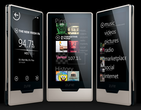
There’s another reason to go with Microsoft’s own terminology. You may think the history of Metro starts with Windows Phone 7, but in fact, its lineage at Microsoft can be traced much further back. You can already see the first traces of Metro in Microsoft Encarta ’95, MSN 2.0 from 1996 (look at those icons!), and later in Windows Media Center in Windows XP. Heck, even Windows Mobile back in 2003 had faint Metro-esque elements, with its straight lines and lack of any 3D effects for UI elements. This all culminated in the Zune HD.
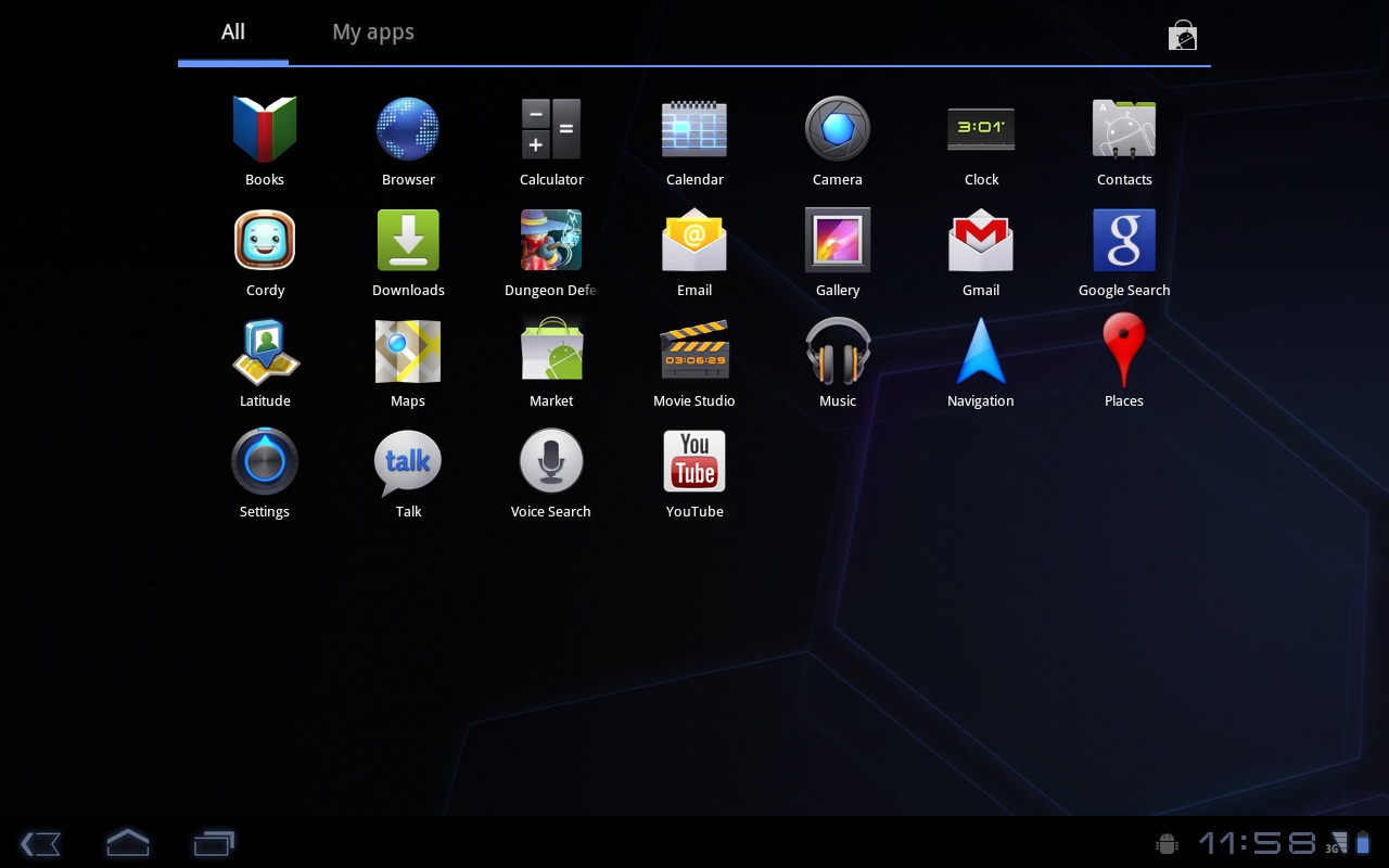
Microsoft isn’t the only major technology company opting for digital design. Google has shifted its design into a digital direction as well. Google’s online services, like Gmail, have all shifted towards a more digital design, and Android hasn’t been left behind. If you compare Gingerbread and earlier to Honeycomb/Ice Cream Sandwich and later, the differences are clear, and we see a move from analog to digital. Android’s Holo theme, designed under guidance by Matias Duarte, is actually remarkably digital, and has, in my view, greatly improved the Android user experience (there are Holo elements in OSNews 5).
I’m not saying that either Microsoft or Google “invented” digital design – I’m only stating that they are two large companies at the very forefront of it. Due to their size and the influence they wield through their platforms third parties develop for, they are also influencing the design of applications.
Now, it’s pretty clear we’re seeing a rise in digital design, and this rise is the subject of a recent article by John Gruber. Gruber wonders why we’re seeing this rise right now, and what the cause of it is. Sadly, while his article poses some interesting thoughts, it’s also – pardon my Dutch – complete and utter nonsense. The core argument of his article is as follows.
What occurs to me is that the timing of this trend, and the fact that iOS – and the iPhone in particular – is its leading edge, is not coincidental. It’s because of retina displays.
The first part is, as I’ve already established, entirely and utterly nonsensical, bordering on the comical. Gruber is obviously an Apple-focussed writer, and there’s nothing wrong with that. However, claiming that iOS applications are the “leading edge” of digital design just because a word game and a few others sport digital designs, while reducing Metro to a footnote, and not even having the stomach to mention Android’s Holo, is simply revisionist history in the making.
Again – I’m not claiming either Microsoft or Google invented digital design, but they are two of the biggest proponents of said design. Reducing them to a footnote, or worse yet, not even mentioning them at all, in an article about the rise of digital design is simply intellectually dishonest. Even the biggest Apple fan has to admit that if there’s a “leading edge” in digital design, it’s Microsoft: Windows 8, Windows Phone 7/8, Xbox, and Microsoft’s online properties all use it extensively.
The second part of his statement has little basis in reality either. His argument is that on smaller, lower resolution displays, you need analog design elements like shadows and depth to create beautiful interfaces. At higher resolutions, this is no longer needed, and as such, Gruber argues, retina displays are the cause of the trend towards digital design.
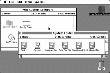
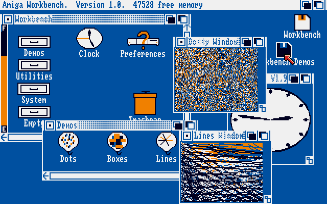
However, if you look at the history of graphical user interface design, Gruber’s theory simply doesn’t hold up. Early graphical user interfaces shunned analog design and skeuomorphic elements, and were, in fact, remarkably digital. Windows 2.0, Mac OS, AmigaOS 1.0 – they all look pretty digital and flat, don’t they? You can take a step further back in time, and consider the Xerox Star. Notice something?
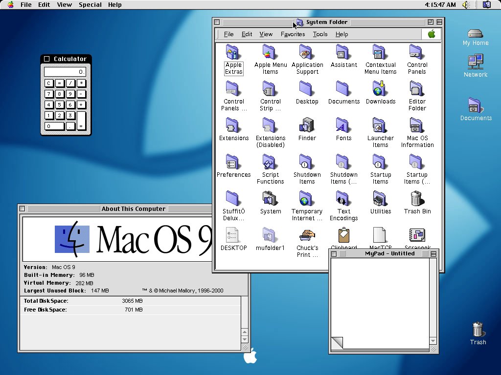
Now, let’s make a jump forward in time. Windows 3.0, System 7, os/2 2.0. As you can see, we’re starting to see some bevels, some crude shadowing – analog design elements. Let’s jump forward again. Windows 95 and 98/ME/2000. Mac OS 9. BeOS 5.0. Even more analog effects. Final jump in time. Windows Vista. Mac OS X 10.5.
The trend is obvious: as we move forward in time, interfaces for desktop computers have become less digital, and more analog; we’re seeing more and more 3D effects, shadows, transparency, gloss, gradients, and so on. The reason for this is is remarkably simple and straightforward: processing power – both generic and graphical – increased, and our display technology got more sophisticated, allowing for an increase in these effects. This is exactly the opposite of what Gruber claims.
The funny thing is – the same happened in mobile technology. As processing power and display technology increased, so did the amount and intensity of analog design elements. Compare Windows Mobile 2003 and PalmOS 5 to Windows Phone 6.5 (the last pre-Metro WP release) and iPhone OS 2.0. As you can see, mobile graphical user interfaces followed the same path as their desktop counterparts.
This actually makes sense from a design standpoint. For skeuomoorphic and analog design elements to properly work, they need to be as detailed as possible, and they tend to take up more space. On the kind of displays used by PalmOS 5 and Windows Mobile 2003, both space and pixels were scarce, and as such, you needed to minimise both the quantity and the size of on-screen user interface elements, while still making them tappable with the stylus. Shadows and bezels would only needlessly take up space, so they were omitted.
Detailed textures (like leather), gradients, rounded corners, transparency, shadows, gloss, and so on: the higher the resolution and pixel density, the better they look. More pixels require more processing power; lather, rinse, repeat. In other words, you would expect that larger displays, higher resolutions and pixel densities, and more processing power would lead to more analog design, not less, as Gruber claims.
And you know what? This is exactly what has been happening in iOS up until now. After the introduction of the retina display in the iPhone 4 in 2010, Apple has only upped its analog design, adding more of it, instead of reducing it – look at Passbook or Podcasts for examples. So far, Apple’s increasing affinity with analog design shows no sign of stopping, although Ive’s new function may lead to changes in Apple’s GUI design.
The actual reason or cause behind the rising popularity of digital design? I honestly have no clue, and even though I don’t think there really has to be a reason or cause in the first place, I do have a sneaking suspicion. Technology has reached a point where we can intricately create the most detailed analog design elements, and yet, both Microsoft and Google have decided to explore the other end of the spectrum. I think this is simply a case of these two companies wanting to differentiate themselves from Apple. Apple clearly has a love affair with analog design, so in order to differentiate their products, Microsoft and Google decided to go the other way.
But then again, who knows. Trends are cyclical in nature, and we may simply be seeing it swing back towards the early days of the GUI – wait 20 years, and it will start to swing towards analog design again.
All in all, it seems as if Gruber is expecting Apple to start moving away from analog design in the near future, and his article feels suspiciously like trying to retroactively come up with a reason as to why Apple would make this move, in such a way that he doesn’t have to give any credit to where credit is actually due – Microsoft and Google.
And this is the meat of the matter. When it comes to graphical user interface design, Apple is no longer leading the pack. Apple is still doing a great job, but they’re not pushing the envelope. Microsoft (and to a lesser extent, Google) has taken over the baton, reaping all the praise for its innovative and unique Metro interface – and there are people in this world who simply cannot accept the fact that the tables have turned.
One final note. It comes as no surprise to any of the regular OSNews readers that I am a huge fan of digital design. However, that doesn’t mean I have an intrinsic hatred of analog design. I just think that the kind of analog design Apple employs is childish, condescending, outdated. Only recently I wrote about Skulpture, a theme with a decidedly analog design that looks fantastic (to me).
Analog design isn’t bad – I just think Apple isn’t doing a very good job of it.
1 Years of aggressive marketing and punditry have done a good job of convincing people that our current crop of smartphone interfaces aren’t WIMP-interfaces. However, if you shove the marketing nonsense aside and take a look at the actual definition of WIMP and its constituent parts (window, icon, menu, pointer), reality comes rushing in. Only the ‘pointer’-part is debatable – however, a touchscreen is still just as much an indirect input device (although far less so) as a mouse, even if the pointer is hidden.
2 On Twitter, Tess wondered if it is possible, according to the definitions cited, to create a non-WIMP interface at all. I honestly do not know, but then again, could (regular) people imagine the GUI and WIMP-interface in the pre-Xerox PARC era? What I’m saying is – just because we regular folk can’t imagine a graphical user interface outside of the WIMP-paradigm doesn’t mean it’s impossible. It just means we aren’t smart or visionary enough.

I don’t know about that label between the designs. Maybe futuristic vs retro ? Analogue doesn’t fit well, shadows, gradients translucency and transparency are not really analogue they are not retro either, but you could say the “digital” side is pretty retro except that Holo is pretty futuristic looking and not retro, I don’t know it just didn’t read right in places.
Who cares what Gruber says ?, I don’t understand why you let him wind you up so much. He is an apple fanatic, there are a minority that wholesale buy into the marketing and brand of a platform, he makes a tonne of money from it. I absolutely agree with you though Apple is probably working on a new futuristic interface and this is his way of trying to side step all that has come already.
On a side note, you have a strong weakness for Microsoft platforms, it is evident in a lot of the articles you publish or comment on, we all have a bias, its inherent to all of us, to say I have no bias I support everything and nothing is just impossible. If you are human and have a passion for a specific field, you will have a bias and they will colour your words, its as simple as that. To not admit it is to lie to yourself, because deep down you know this bias exists.
This is probably why you think the Metro interface is such a “visually unique interface”. Why you think “Microsoft (and to a lesser extent, Google) has taken over the baton, reaping all the praise for its innovative and unique Metro interface – and there are people in this world who simply cannot accept the fact that the tables have turned.”
Metro as you mentioned goes back to the Zune (and even windows 2 or 3 to some extent, its a pretty retro interface in places) which was a commercial flop, low and behold they port it to everything windows and sales in all windows product lines are flopping, its a bad interface, if we just go by sales.
You think it doesn’t sell because its too different, I look at it and see a boring / bland interface.
http://www.extremetech.com/wp-content/uploads/2012/10/windows-phone…
That is the interface, its all monotone everything looks the same, I don’t see how that grid of pseudo icons excites you so much. There is no detail just a mainly monotone colour, plastered all over your screen and this is meant to excite the masses ?
I am not all that keen on walking around with a yellow phone or brightly coloured phones generally, its like the people that drive Yellow Porsches, I see 1 of them and instantly think you dick. Its just a bit childish. If I want to add colour I could buy a silicone cover in some bright colour, but I would rather look at the screen rather than be distracted by the phone. I like Sony’s design ethos:
http://www.youtube.com/watch?v=ktIhuJA_92I
This is what I think you miss, your so distracted by the UI of the OS that you miss the purpose of the device, the content, the use and most importantly the applications. In terms of hardware, the stuff Sony is doing with NFC is really cool as well, touch the tv remote to display the phone screen on the tv is really useful.
So for you the metro interface may be “innovative and unique”, but to others like me its pretty monotone and bland, with hardly any real configurability, can you even apply a good background wallpaper to it ?.
It does nothing for the content, it doesn’t improve usability in any meaningful way (in fact some if not most would agree that windows 8 usability is just awful with a mouse and keyboard) and it does nothing for the content / applications either (again this is worse – no proper window handling in the metro side of windows 8 ).
Is change just for the purpose of being different better? is it really innovative ? Does Metro improve usability does it make the applications more accessible ? I think if you were to honestly answer these questions, you would realise why the interface is a flop. The same reason why Apple “natural” scrolling is just a dumb ass idea as well.
yeah, its a terrible, terrible, terrible labeling system that completely distracts from the discussion Thom is trying to start. It couldn’t be worse labeling, I’d take Bieber UI vs Gaga UI over this nonsense.
You’re obsessing over the wrong details, and Thom is essentially right here: It’s about Skeuomorphism (modeling the analog world) versus Digital (modeling digital design).
Honestly yes. To me Metro does improve usability as it provides me with more “at a glance” information than Android or iOS.
As far as “applications more accessible” that is kind of hard to gauge. iOS doesn’t have a home screen and Android’s default app drawer is a mess (lacking any customization/organization options). Either way it’s about the same number of touches to get to a non-pinned application on WP as it is on Android or iOS.
Nicely done.
My problem with the overuse of textures is that they make your app lack future proofing for varying resolutions. Your texture may look nice on your 800×480 screen, but bump it up to a higher resolution for example and you’ll get a lot of fuzziness.
The solution to this on iOS have been these insane high resolution textures which make apps almost comically large in size.
Its a shame because a digital interface on a retina display (buzzword overload) would look absolutely phenomenal.
I don’t think pure digital is here to stay, and we’ll find a nice equilibrium in the future. I think Holo has it about right in terms of balance and visual identity, but the way they use Holo in Android, to me isn’t as thoughtful as it could be.
A Holo based UI which eschewed the grid of icons and stopped trying to be like iOS would be pretty compelling. Something like how Jolla uses edge gestures in Sailfish and still maintains some semblance of a digital look.
On the flip side, Metro is a significant design hurdle for developers. Its a lot easier to design a good looking app in iOS or Android. Metro takes a lot of thought. Text plays a huge role. Visual structure is defined by the text, so font faces, sizes, and decorations are especially important.
For the sole developer that’s a problem. Using Metro to its maximum potential requires you sometimes to rethink how you’d traditionally design an app.
Also while with skeumorphic displays you can add “flare” to your otherwise identical looking app by using textures, using Metro it is much easier to have every app look like this big black void with white text.
Thom, the pointer isn’t hidden on touchscreen devices; It’s just located someplace else.
http://tinyurl.com/bbu9rz9
It’s attached to your hand.