Following our recent interview with the iPhone collage artist _meta_, a few readers asked for more such articles. So here’s one on how to create your own such digital collages! Technically-speaking, digital collage, illustrations, and photo-montage are the same thing. It’s just pictures or drawings put together in a single image, made look like a seamless, coherent piece. However, there are distinct differences in the way these are perceived and enjoyed, they essentially are different sub-genres.
Collage is usually put together without much photographic manipulation, it looks coarse, like it doesn’t belong. Illustrations usually feature a center object in the middle of the screen, blend together with designed-from-scratch or actual drawing elements (example). Photo-montage aims to create a scene that looks like it’s a real photograph or frame still, rather than a collection of separate photographs put together (example). Apart of the technical differences, the “moods” of the pieces are different. Photo-montage in art is mostly used for fantasy scenes, illustration is mostly used in commercial magazines, and collages as posters or high art.
I personally prefer collages exactly because they’re so often coarse. Some pictures can be black & white, other can be colored, other can have a different print texture etc. And their cut-outs are also coarse, often visibly so. When I look at these kinds of collages, this non-perfection is part of the magic. The fact that things in the collage feel that don’t belong together, enhance their surreal feeling, making them stronger as artworks. There are several sub-genres of collage, but currently the “vintage surreal” ones are in fashion.
Here’s some advice about how to create digital collages that look like real, paper vintage collages.

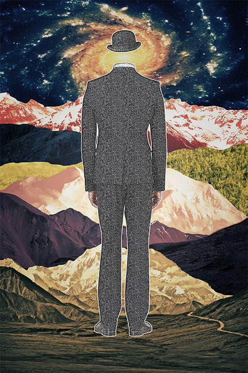
“Unhid (My Homage to Magritte)”
1. You don’t need to own Photoshop CS. Photoshop Elements 10 or The Gimp will do the job too. I don’t find The Gimp’s usability as good as Photoshop’s, but collages don’t need too advanced features, so you can get by with The Gimp just fine. Plus, the various freeware texture images you will need occasionally can be loaded via The Gimp too. Advanced plugins are very rarely used, since these are more suited for photo-montages. As long as you have the basics (curves, levels, exposure, saturation, contrast & brightness, sharpness etc), you’ll be fine. I highly suggest to get a tablet though.
2. There is a standard poster size, at 24″x36″ (printers that can print at that size cost about $1100). Create a 4320×6480 image, RGB, 8 bit, at 180 dpi, with a transparent background. You can also calculate and adjust the sizes for the other standard poster sizes, which are 18″x27″, 12″x18″, or you can go square (e.g. 24″x24″, 18″x18″, or 12″x12″). I’d avoid using 32bit color, since it’s too slow, and not much photo-manipulation is happening on collages, so the quality degradation is minimal. I personally prefer to work with the RGB gamut and the “Adobe sRGB” colorspace, it deals fine with my 18″ inkjet printer.
Update: The resolutions for standard poster sizes, set at 180dpi, RGB/sRGB:
24″x36″ = 4320×6480
24″x24″ = 4320×4320
18″x27″ = 3240×4860
18″x18″ = 3240×3240
12″x18″ = 2160×3240
12″x12″ = 2160×2160

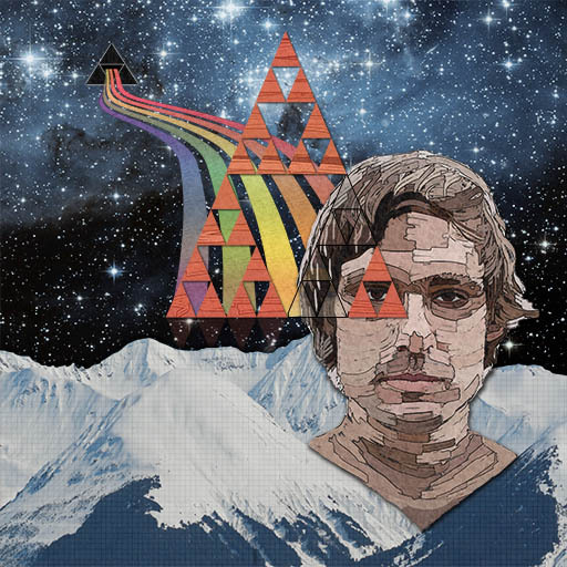
“When you look into an abyss, the abyss also looks into you” (Nietzsche quote, philosopher/musician John Maus as model)”
3. The “real” paper vintage collages are made out of old magazines found on second-hand stores. I personally prefer to deal with digital images, so most of the time I use Creative Commons pictures found on FlickR. When cutting out an object to use in your collage, you can go either way: either use a block eraser which is pretty coarse, or you can go anti-alias and very precise. Either is fine. To give the illusion that this was a magazine cut-out, you can add a white stroke around the image, at 3px thickness. Avoid (large) shadows and glow, these are stylistically suited for photo-montage or illustrations only.
4. Put together your piece. To help with composition, use visual guides. If some of the images are too small for your big poster-sized documents, scaling them would pixelate them. The way I go around this occasional problem, is by using plugins that emulate painting looks (e.g. watercolor painting etc). When the scaled element is run through a painting plugin, it just looks like it was painted, it doesn’t look pixelated anymore. It’s just a trick, and here’s an example of it. For other works, like the Nietzsche one shown above, I actually painted it manually. If you can’t paint well, you can still draw a few simple things if the piece demands it (example).

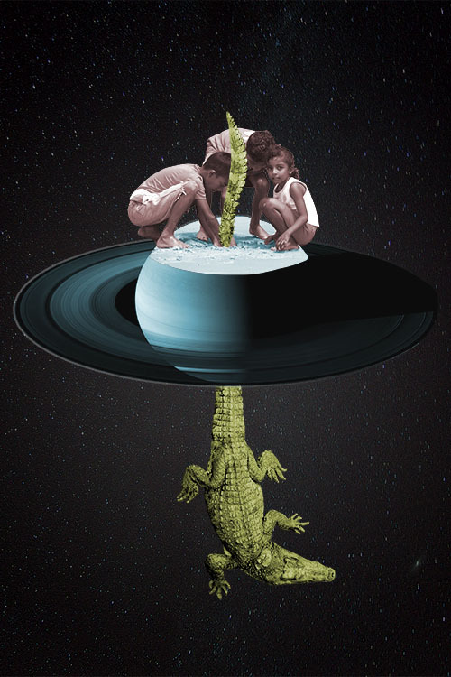
“Look what I found!”
5. Then add a texture on each of the images consisting the collage. Different elements of the collage should have a bit different textures, to emulate that they were cut-out from different printed magazines. The textures to use are noise textures, or print textures. I usually use these at around 16% to 32% opacity. If you prefer to use the same texture in the whole document, use 8% opacity, and then also use a reversed radial gradient, which will give a “fall-off” look (it’s like a vignette, but not exactly).
6. Then, bring saturation down. Old magazines had a bad color reproduction, so you’ll need to emulate that. You might need to adjust brightness & contrast. Remember, film was low contrast. For some of the pieces you might want to “colorize” them, for example, some color pieces make them black & white, or sepia, or other monochromatic color. For other collage elements, you might want to keep their original full colors.

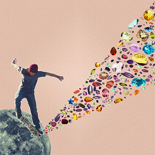
“Extraction of Precious and Other Stones”
7. Finally, use curves on the layers of the biggest pieces, or on the whole of the image to give it a vintage look: draw an S curve for RGB, and then pick the BLUE curve and draw it exactly the opposite. This will give your image a Polaroid blue look. You can also experiment with the RED and GREEN curves to emulate different old camera looks.
8. Enter EXIF information, linking to your Creative Commons source images, and export in high quality JPEG or PNG, and upload to your favorite image site. Note, TumblR is where most of that type of art is appreciated. I usually have 0 views on FlickR, but hundreds (or thousands) on TumblR for the same pieces. Just make sure you tag your TumblR post with the word “collage”.
How would you know if a collage piece is good or not? Ask yourself the question: “would I pin it on my own wall?” If the answer is “yes”, then that’s a worthy collage piece. So, good luck, and go be artistic!

It’s great work (imho) and I hope to see more from you (and other artists you discover) in future.
Alas, I know all these techniques you’ve written about. I’m not complaining or anything; it’s just that when I saw the article, I thought it’d be some sort of follow up to the previous one showing how to do all this on your iDevice (or Android). Sure, the same theories/practices/techniques apply, but I was hoping for some sort of run-through of the mobile apps (as mentioned by _meta_ in previous article) one could use on a phone/slate, and whether they gave the user enough control and output at a decent enough quality.
Still, it’s a nice read on the whole. Thanks for sharing again.
Edited 2012-06-01 13:56 UTC
Photoshop touch. (or photoshop express) or Auto desk Sketchbook can do this kind of stuff.
I don’t have an iPad or any tablet for that matter, so I can’t check out Photoshop Touch ($10), but it’s possibly the most complete app to do this kind of thing.
On my Galaxy Nexus I tried Photoshop Express (free) and Autodesk Sketchbook ($2). The Sketchbook does all the basic cuttings and trasnformations, it has layer support too, and then Express does all the color stuff (you would have to import the layer parts one by one on Express, don’t try to color-correct the whole final image, it won’t look as impressive).
You might want to create on an actual computer a transparent document and use that as your starting point, just so it forces Sketchbook to use the predefined DPI and resolution.
There are things missing though: gradients, textures, strokes (for the various layer elements, separately). These are part of the layer control on Photoshop CS and are used quite a bit. Let us know if there are any apps that can do these. Also I didn’t notice any selection methods, they are important if you only want to keep specific parts of the image in a specific shape (so either selections, or layer masks become important).
Photoshop Touch is the one to try for sure. The tutorials even give you some of the basics. One guides you to removing people from an image, one guides you to replace a colour, one shows you how to combine 2 images seamlessly. With those techniques, and the extra control the app gives over Sketchbook, I think it has everything covered.
For mobile work you will have to create the 12×12 or 12×18 resolutions (calculate them based on the res I mentioned for 24″x36″), since some of these apps might not be able to process them fast-enough otherwise. Other than that, the process is the same, as long as you use the apps that can do all the things mentioned.
Personally, I don’t think I could do the cut-out well-enough without a tablet stylus. Maybe the Samsung Galaxy Note is the best device for that job, because of its larger screen and its stylus.
Edited 2012-06-01 21:01 UTC
that was all
keep up the good work ! 🙂
Good article, I see them on facebook but I didn’t realise so much work went into them.
It usually takes me between 3 and 5 hours to do a collage. In one instance it took me up to 8 hours.
Edited 2012-06-03 09:29 UTC